Client: Binza
Packaging
Identity
Art Direction
BINZA
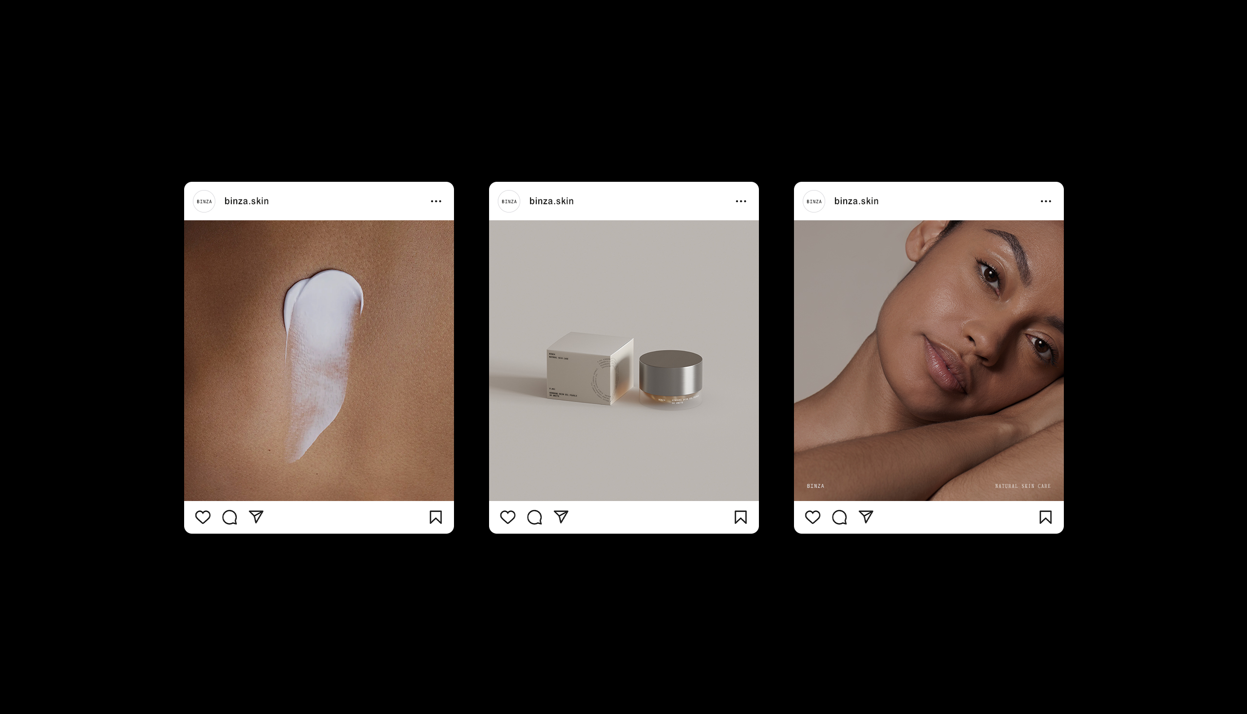
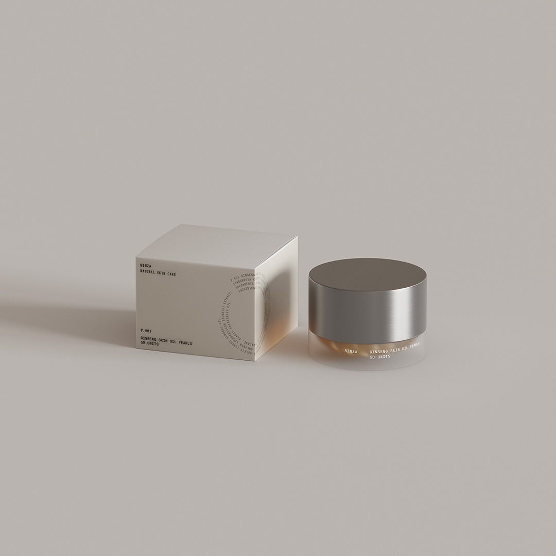
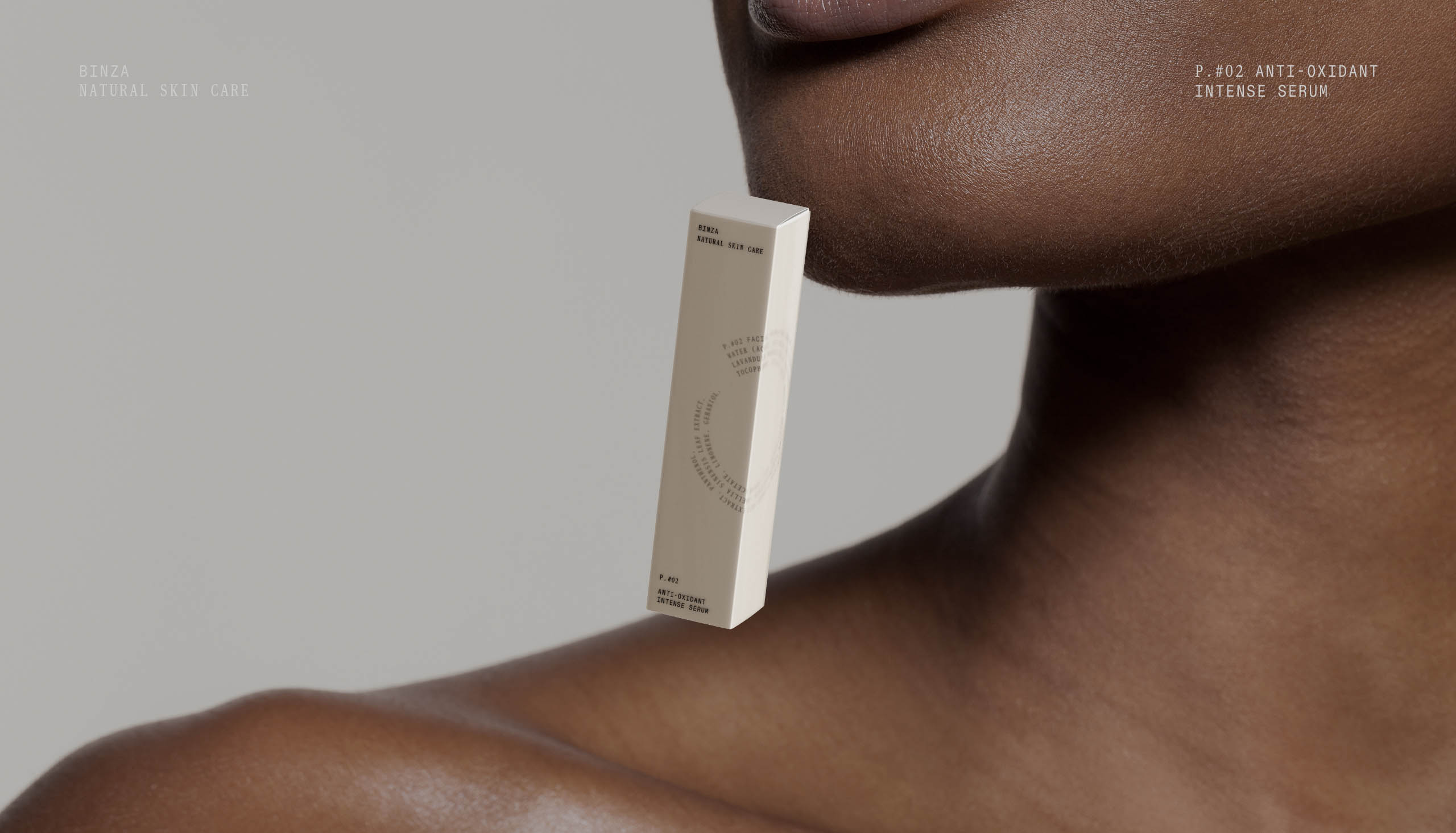
Binza is a very thin and flexible skin that wraps the onion or a thin and delicate tissue or peel that covers the inner part of the shell of eggs. Based on this concept we developed the verbal and visual identity for the natural cosmetics brand.
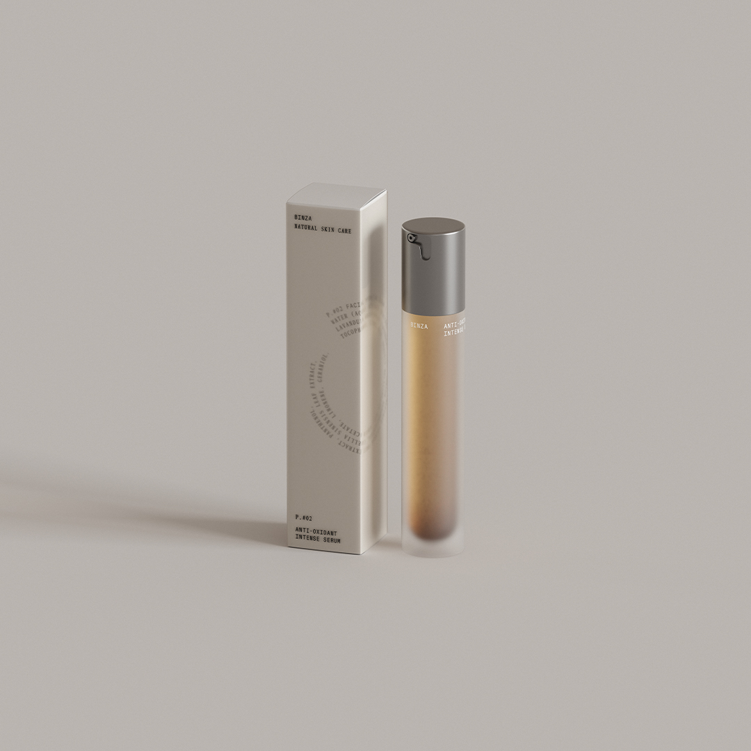

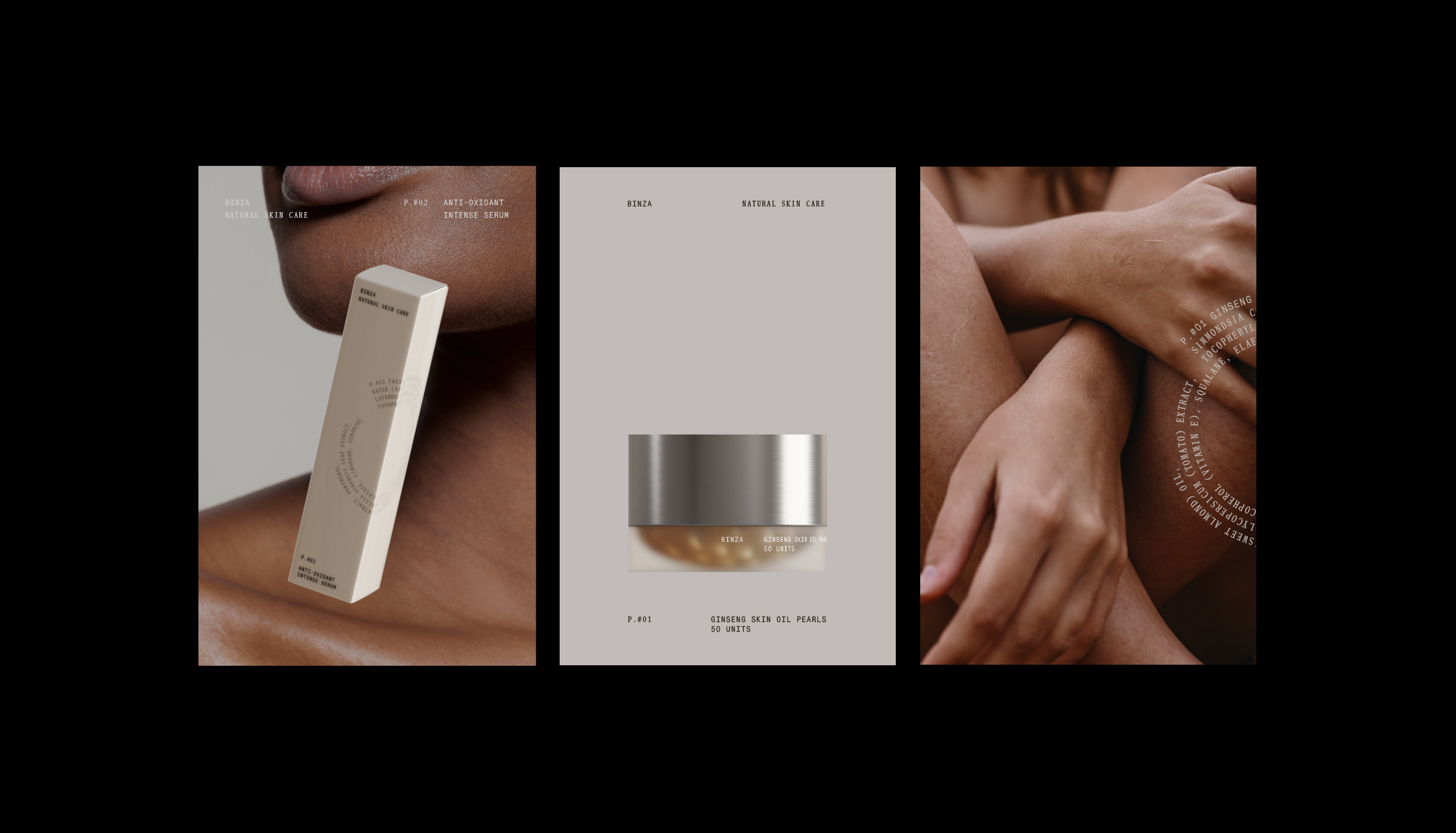
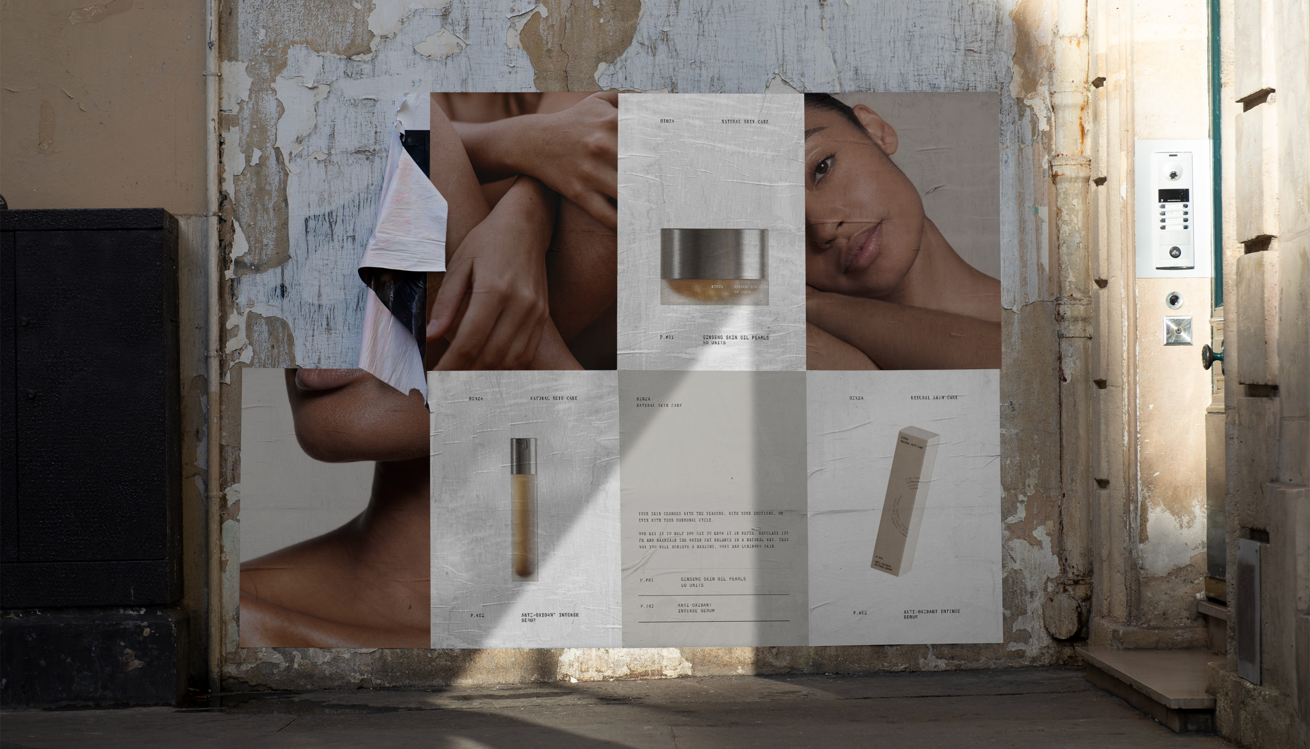
Following this naming idea, we proposed a structure of layers and transparencies to create the different packagings.
